

To make a sign people can read from the road, keep it to 7 words or fewer, say one thing, and use big, bold sans-serif letters in high-contrast colors like dark on light. As a rough guide, plan about 1 inch of letter height for every 10 feet people will be from the sign.
Most hard-to-read signs fail for the same few reasons: too many words, letters that are too small, and colors that blend together. The rules below fix all three. They work for yard signs, sidewalk signs, wall signs and banner stands.
Shop signs built to be seen
Every sign prints in full color. Order by 12pm and it ships the next business day, with free shipping. Real people check every file before it prints and contact you if something looks off, like text too close to the edge.
-
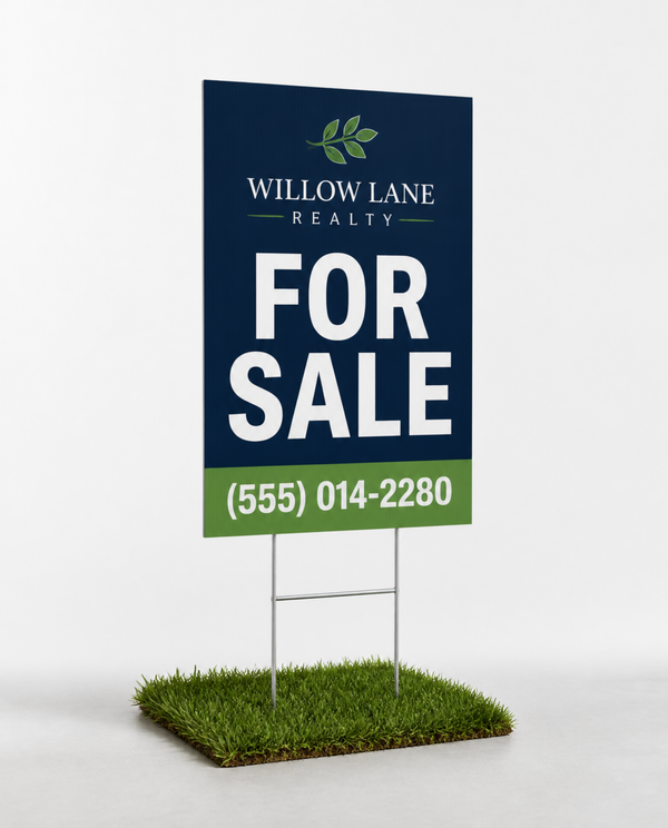 Yard Signs
Corrugated Plastic with Optional H-Stakes
As low as $13.99
Shop sizes
-
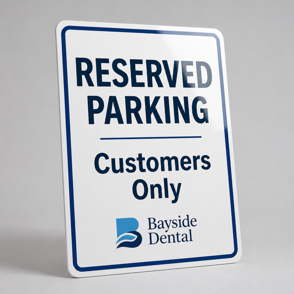 Aluminum Signs
Rust-Proof .040 Aluminum, Rounded Corners
As low as $26.99
Shop sizes
-
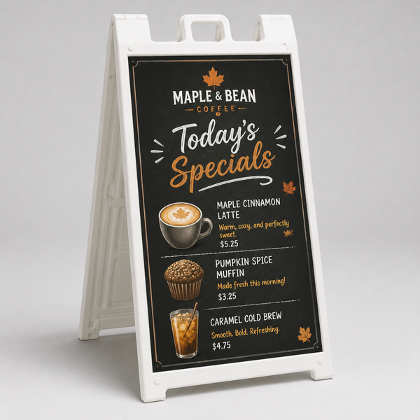 A-Frame Sidewalk Signs
Frame and Prints Included
As low as $197.99
Shop sizes
-
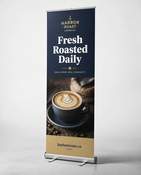 Retractable Banner Stands
Standard Roll-Up with Travel Bag
As low as $109.99
Shop sizes
Rule 1: Use 7 words or fewer
A driver has a moment to read your sign, not a minute. For drive-by signs, aim for 7 words or fewer in the main message, plus a phone number or website. Cut anything people don't need to act. "Family-owned since 1998, serving the greater metro area with pride" becomes "Lawn care. Call today." and a phone number.
Rule 2: One sign, one message
Pick the one thing you want people to know or do. "Open House Sunday." "Now Hiring." "Happy Hour 4–6." If you have three messages, make three signs. On our sign pages you can click "Add another job" to order different designs in one order, and your bulk price is based on the total.

Rule 3: Size your letters for the distance
A common rule of thumb is about 1 inch of letter height per 10 feet of viewing distance. It's a starting point, not a promise. Font weight, contrast, light and speed all change how far a sign reads.
- About 30 ft away: main words around 3 in tall.
- About 50 ft away: main words around 5 in tall.
- Faster traffic: go bigger and use fewer words.
Not sure what size sign fits that? See our yard sign size guide.
Rule 4: Use high-contrast colors
Contrast matters more than color choice. Dark text on a light background, or light text on a dark background, reads best. Proven pairs include black on white, navy and white, black on yellow and white on dark green. Avoid pairs that are close in brightness, like red on green, yellow on white or gray on blue. They may look fine on your screen and disappear outside.
Rule 5: Choose bold sans-serif fonts
Simple, thick letters without little tails (sans-serif fonts) read best from a distance. Keep script, handwriting and thin decorative fonts for small accents only, never for your phone number or main message. Use one font, two at most, and skip all-caps for long lines since mixed case is easier to read quickly.
Good vs. bad: a quick comparison
Hard to read
Fifteen words in a thin script font, light gray on white, with a small phone number tucked in the bottom corner right at the edge of the sign.
Easy to read
"Fresh Lawn Care" in bold sans-serif, white on navy, with a large phone number centered underneath and plenty of space around the edges.
Hard to read
Three offers, a logo, a photo, a website and two phone numbers all fighting for space on one 18 × 24 yard sign.
Easy to read
One offer, one phone number, and a logo that supports the message instead of competing with it.

Rule 6: Leave margin and make contact info big
Keep important text and logos away from the edges. Our upload page shows the safe area for your sign size, so you can see exactly where to keep key details. Your phone number or website is often the whole point of the sign, so make it one of the biggest things on it.
- Keep key text inside the safe area.
- Use a short, easy URL or a phone number, not both if space is tight.
- Add a QR code only on signs people walk up to.
See more on our A-frame sidewalk signs page.
Rule 7: Test it from a distance
Before you order, print your design small on regular paper. Tape it to a wall, then step back. If the sign will be read from 50 feet and your paper copy is a tenth of the real size, try reading it from about 5 feet. If you squint or have to think, cut words or make the letters bigger. Ask someone who hasn't seen it to tell you what the sign says in three seconds.
It also helps to picture the real spot. Will the sign sit in bright sun, in shade under a tree, or near a busy storefront full of other signs? A sign competing with a lot of visual noise needs even fewer words and stronger contrast to stand out.

Set up your file
- Make your file the full sign size, or the same shape at a smaller size. A 9 × 12 in file for an 18 × 24 in sign works because we scale it up for you.
- In Canva, start with a custom size that matches your sign (for example 18 × 24 in) instead of a social post or flyer template.
- Keep all key text inside the safe area shown on our upload page.
- Use high-resolution images and logos so they stay sharp when scaled.
- Double-check your phone number, website and spelling.
- Upload on the product page, or check out now and email your file later.
Tip. Need help choosing a material for where your sign will live? Read our sign materials guide.
Readable sign FAQ
How big should letters be on a sign?
A common rule of thumb is about 1 inch of letter height for every 10 feet of viewing distance. Treat it as a starting point and go bigger for fast traffic or poor light.
What's the most readable color combination for a sign?
High-contrast pairs like black on white, navy and white, or black on yellow. What matters most is a big difference in brightness between text and background.
What font is best for signs?
A bold sans-serif font. Avoid script and thin decorative fonts for key information like your phone number.
Does my file need to be full size?
No. A file in the same proportions as your sign works too. We scale it up, and our upload page shows the size and safe area.
Will you check my design before printing?
Yes. Real people check every file before it prints and contact you if something looks off.
More sign guides

Trade Show Checklist: Every Sign Your Booth Needs
From the back wall to the QR code on your table, here's every sign a trade show booth needs, how many banner stands to bring and...

Corrugated Plastic vs. PVC vs. Foam Board vs. Aluminum: Which Sign Material?
Corrugated plastic, foam board, PVC, aluminum or ACM? Here's how each sign material compares indoors and out, and which one fits your job.

Yard Sign Sizes: Which Size Should You Order?
18 × 24 is the standard yard sign, but it isn't always the right one. Here's every size we sell, how far each reads, and when...
Ready to order your signs?
Order by 12pm and they ship the next business day, free.